Wednesday, December 19, 2012

Final Exam

Pattern:


Tutorial
http://www.vectordiary.com/illustrator/snowflakes-tutorial/
http://www.dezignmusings.com/2008/12/make-stylized-christmas-treee-in.html

I used Brush tool, Symbol Sprayer Tool, Pen Tool, Gradient and different kinds of shape tools. I also used Stylize under the Effect Menu.

Friday, October 26, 2012

Halloween Poster

I learned how to make a double gradient and how to apply an oppacity mask. The watercolor strokes are intersting because they can make the picture look more real and ancient. I could see the design elements of shape, typeface, space, and value.

Wednesday, October 24, 2012

Splat


I set the background a light gradient color. I chose two of the Grime Vector Pack in the Symbol Libraries and changed their color. Then I dragged them into the Symbol Panal and used the 3D Rotate to generate the shape. I used 3D Extrude & Bevel option to manage the text. The Map art option is intersting which helps to apply the splat onto the letters.

Tuesday, October 16, 2012

Snowboarder


I used live trace to create the snowboarder which is interesting. The gradient tool and the symbol tool are also useful and easy to work with. I used pen tool to draw the smooshes and added pattern using the options within swatches panel. Thia step is a little tough because I could not operate with the pen tool very well. The easiest part is to add the text at the end.

Friday, October 12, 2012

Lily Pad


Although it took a lot of time to finish, the lily pad is really beautiful. It is fun to make a picture like this by myself using the Adobe Illustrator. The process of creating petals took a long time, but I practiced pen tool and blend mesh.

Wednesday, October 3, 2012

My Sign

This is the sign I picked. I used rectangle and rounded rectangle tool to create the basic shapes, and found similar colors for each shape. The direct selection tool helped me to adjust the size and shape. I used pen tool to draw the curly lines on the top right corner of the sign. On the bottom right corner, I used the anchor point tool to draw a triangle, and then choosed the transform effect under distort in order to create several copies of triangles. I think the hardest part of this work is to create the abnormal shape on the top right corner; the easiest part is typing the letters.

Wednesday, September 26, 2012

Sign Trace


While creating this sign, I used the template layer option, shape tool, direct selection tool, anchor point tool, offset path tool, brushes, type tool and so on. The easiest part to me is selecting the closest font for the words and adjusting their size and color. The hardest part to me is using the Anchor Point tool to tighten up the top and bottom of the rounded rectangle shape.

Thursday, September 20, 2012

My Personal Quote

My quote is: "It does not matter how slowly you go as long as you do not stop. (Confucius)" I chose this quote because it tells people to pay effort and never give up. Even though the progress is slow, as long as we keep going, we would finally reach the goal. Confucius is the first teacher in China who affect the Chinese culture.
I made the quote look straight and well arranged in a balance from top to bottom. I rotated some of the words in order to create variaties. I used the color blue for the word "slowly" because blue means calm and peaceful. I chose orange for "go" because orange represents energy and enthusiasm. "Stop" is the most important word of this quote so I capitalized it and made it red. As Confucius was a man who lived in ancient China, and there is still a lot of mysteries about him, I used the color purple to express the mysterious.

Tuesday, September 18, 2012

Glyph


This is my glyph. I chose a cute cartoon character.I used different letters and symbols to build up this glyph. I first set up the eyes, nose, mouse and feet of the character to get a basic overview; then I moved the letters to build the outlines. It was a little hard to draw the outlines of the picture. Moving and rotating each letter needs a lot of time. So I reflected some of the letters and put them on the opposite side to make it easier to do.

Wednesday, September 12, 2012

Typography

I used the type on a path tool to type on two rounded rectangle. This is the shape of design elements. The quote is focused mainly on film, so I made the word "film" large and standing out. Other larger and bolded words are the keyword in the quote. They need to be seen at the first glance.


I used brown for the main word "film" because watching a film is a relaxing acticity, and brown is a formal color which can occupy this quote. I chose orange for "music" and blue for "fiction" because these two words express the main idea of the sentence; orange shows the enthusiastic of music, and blue shows the mysterious of fiction. "Mood", "feeling", and "theme" were colored purple because they are spiritual words. Pink is used for "emotion" because it represents the warm and caring feeling.

Tuesday, September 4, 2012

Elements of Design

There are eight elements of design. They are color, line, mass, movement, space, texture, type and value.

Color is also known as hue. It is a special light wavelength found in the color spectrum. White light broken in a prism has seven hues: red, orange, yellow, green, blue, indigo and violet. In art, color ranges circularly from red, to yellow, to green, to blue, and then back to red. The three primary colors used in computer are green, blue and red. All the colors are produced by combining these three basic colors.

A line is a point in motion, with only one dimension - length. Line varies in direction, defines contour or the edge of an object, creates the illusion of space and form, and creates a pattern when repeated. Line has both a position and a direction in space. The variables of lines are size, shape, position, direction, number, interval and density. Points create lines, lines create shapes or planes and volumn.

Mass is interchangeable with volumn. A mass is a solid body or a grouping of visual elements that compose a solid form. It is the two-dimensional appearence of a three-dimensional form. Volumn is a three-dimensional form comprising length, width, and depth. Volumn advanced when compared to a plane and also carry greater mass and visual weight than planes or surfaces.


Movement is also known as motion. It is the process of changing place, direction or orientation through the visual illustration of starting or stopping points, blurring of action, etc. This is not animation. Animation is a product of movement. Movement is the way in which the elements of design are organized so that the viewer's eye is led through the work of art in a systematic way.

Space is the area around, within or between images or elements. It is a 2D or a 3D element defined by other elements of design. Shape can be displayed by overlapping spaces. Space can be used to emphasis the subject. Varying of object size or placemnt, varying of color intensity and value, and use of detail and diagonal lines can also create space.

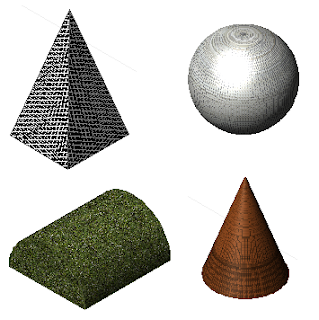
Texture can be defined as “the properties held and sensations caused by the external surface of objects received through the sense of touch.” It tends to play more of a supporting role in design, rather than being the main player. Basically, texture is a technique used in two-dimensional design to replicate three-dimensional surface through various drawing and media techniques. In 3D, it happens by touch or visual experience. Texture can be real or simulated, can form a surface, can be natural or man-made, can achieve emphasis, and can be affected by lighting consitions.


Type is often an element in the form of visual communication. It is considered an element in graphic design. Type is a fundamental part of any design it appears in. It can be used as text to read, as a shape and as a visual element where the choice of typeface conveys an emotion or mood. Size, font and shape can all be important parts of type.


Value refers to the relative lightness or darkness of an area. It is measured in a graded scale from white to gray to black. Variations in value are used to create a focal point for the design of a picture. Gradations of value are used to create the illusion of depth. Areas of light and dark can give a three-dimensional impression.